The Problem with Traffic
Traditional audience metrics — pageviews, sessions, engagement — only tell part of the story. We found that the articles bringing in the most raw traffic often looked nothing like the articles people read right before subscribing. That gap pointed to a measurement problem. We needed a metric that evaluated stories not by how many people they reached, but by how effectively they converted readers into subscribers.
Building the Metric
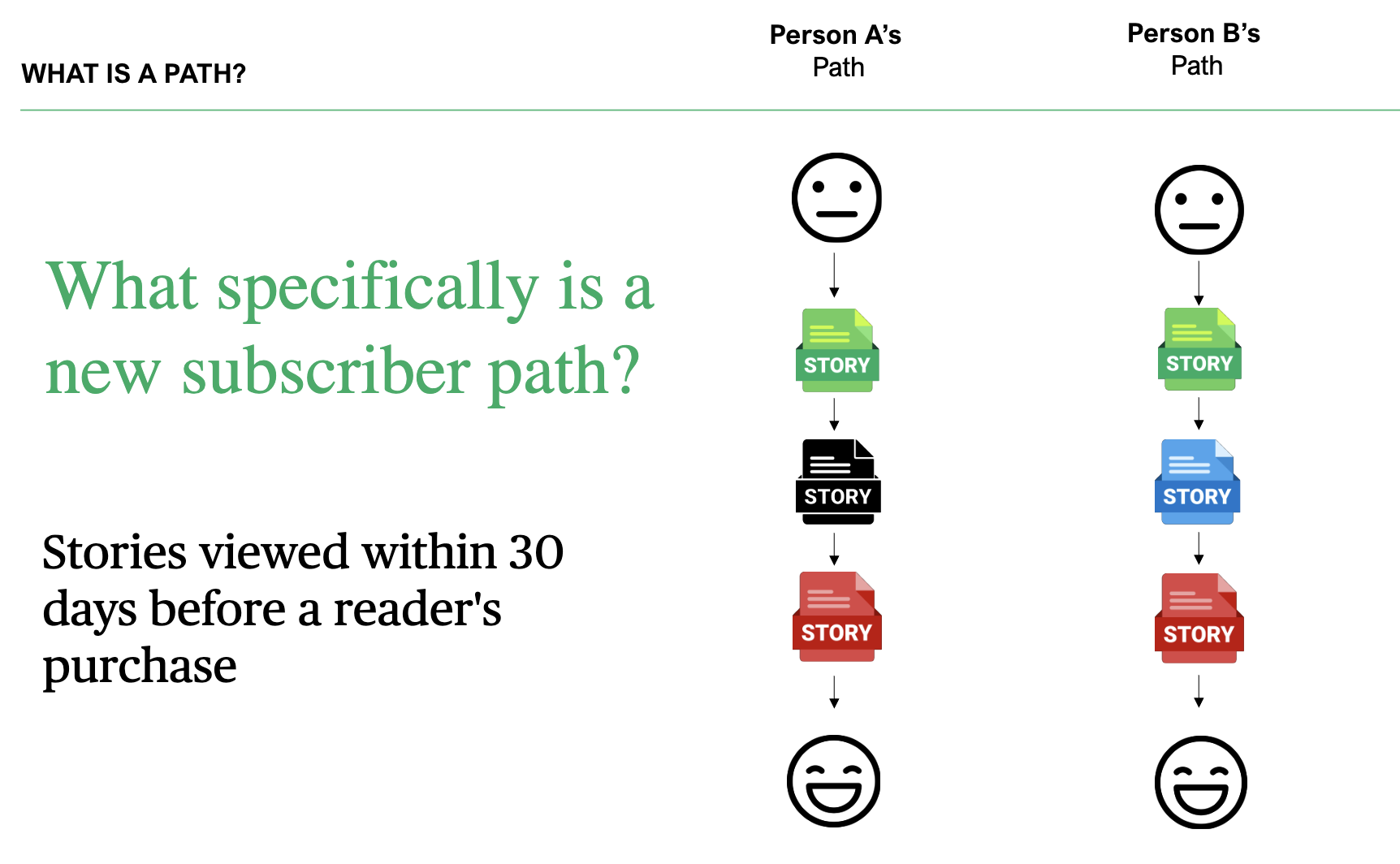
We developed a multi-touch attribution model that counts how many new subscribers engaged with a story in the 30 days before their purchase. We called the output new subscriber paths — a name chosen deliberately to be legible to everyone in the newsroom, not just the data team.
The results were immediately striking. Editors looked at the top-paths stories and said, unprompted, that they felt like good journalism — the kind of work that earns a subscription.
Putting It in Context
Raw path counts are tricky to interpret. Three factors complicate any direct comparison between stories:
- MaturityTraffic accumulates in days; paths take weeks. A story isn't fairly judged until it's had time to convert.
- AudienceA piece on Minneapolis city politics draws a different — and smaller — potential subscriber pool than Vikings coverage. That difference shows up in the numbers.
- Discount environmentPromotional pricing at the time of purchase inflates path counts across the board.
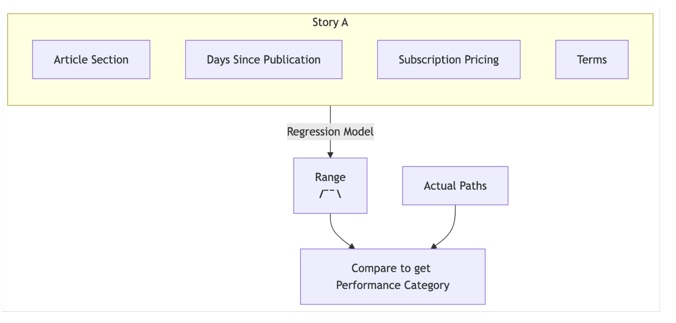
Editors needed a way to account for all three when evaluating a story. We turned to a Negative Binomial Regression model, well-suited for count data with overdispersion. The model learns the historical distribution of path counts and attributes variance to two key factors: how long the story has been published, and which section it ran in — a reliable proxy for audience.
The Framework
With the model fitted, we can generate an expected distribution of paths for any story given its section and age. That gives us a principled basis for comparison.
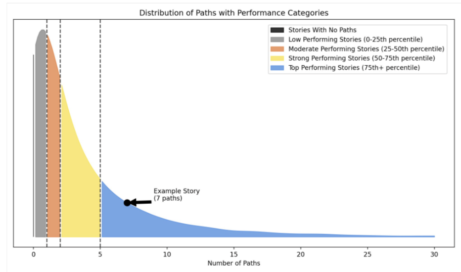
A story outperforming 90% of its expected distribution earns a "top-performing" label; one in the bottom 20% is flagged as "low-performing."
Impact
The metric has become a fixture in how editors set goals and evaluate their sections. It gave the newsroom a new dimension to think about story performance — one that aligns more closely with the Star Tribune's core business objective — and contributed to a broader cultural shift toward evidence-driven editorial decisions.